

Color clash refers to contrasting color matches, including strong or complementary ones. Robust color matching refers to two colors far apart, such as yellow and purple, red and lime green; this colour matching is more intense.
Complementary colour matching refers to two opposite colours, such as red and green, green and orange, black and white, etc.
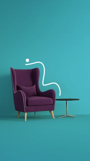
The colour clash has become a good choice for many designers to express the theme of "self-confidence and vitality, living their personality and flaunting their verve".
Colour clash design is a special colour expression technique that juxtaposes two or more colour blocks of different colours to create a strong visual impact in terms of colour.
Through the strong contrast and mixing of colours, it can collide to create a special sense of beauty and bring endless visual enjoyment. Applying colour clash design in interior design, successful colour clash can also bring stunning visual impact and fashion sense to the space.
From the perspective of colour ring selection, the colour scheme can be subdivided into strong colour matches and complementary colour matches.
Intense colours with two far apart colour matches, such as yellow and purple, red and lime green, create a relatively strong colour scheme; complementary colours with two close colour matches, such as red and green, green and orange, and black and white, create a complementary colour combination that is challenging and controversial, requiring a high level of skill.
The elements that can be "clashed" in colour design include brightness, purity, warmth, and area. Complementary or contrasting colours are only a small part of this. There are many patterns; it may be a large area collision, but it can also be a slight colour block part of the clash. The two clashes do not have to be symmetrical; they can be a "small clash" or a "less clash".
Successful colour design, the colour ratio, and concentration and area of the screen should be designed, such as the purity, brightness, warmth and coolness, and the size of the exact same red and green colours, will undoubtedly cause visual discomfort, and complete complementary colour contrast will only cause visual fatigue.
At the same time, the colour clash design should also be combined with the surrounding background colour situation, for example, by letting the background colour set off the complementary colour, the conflict will be enveloped under the main colour system, and it will look more harmonious.
The combination of colour and gradient can make the colour effect more flexible, color gradient is a unique expression of the two-colour gradient, colour fusion, two very different colours slowly approaching the gradual integration, so that the collision has a buffer, gradient of expression is different from the visual impact of a large crash of colours so that these seemingly incompatible colours have a more harmonious and echo, and thus create a chic The sense of beauty.
The visual expression of the colour clash design is powerful, there is a strong sense of contrast, and often people in work and life have to contrast to illustrate the characteristics of things.
This time the use of a colour-clash design is very reflective of the problem, if you encounter the need to contrast, you may want to try such a colour-clash contrast method, and there will be unexpected gains.
In interior space design, the colour clash is also a good expression technique to strengthen the visual expression by contrast.